
Signstown / Yard sign guides
Yard Sign Design: How to Make It Readable From a Moving Car
Practical design rules for yard signs: word count, letter size, contrast and layout that work at street speed for realtors, campaigns and local businesses.
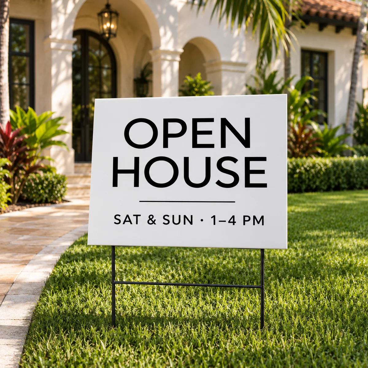
You have about three seconds
Most people see a yard sign from a moving car. Plan for one message, five to seven words, and one way to reach you.
Big, bold and simple
Use a heavy sans-serif typeface and make the most important word as large as the sign allows. Thin script fonts and long phone numbers disappear at a distance.
Contrast beats color
Dark text on a light background, or light on dark, reads better than two bright colors side by side. Red on blue and green on red look striking on a screen and blur on the street.
Check it before you print
Print your design on a letter sheet, put it on the floor and look at it from across the room. If you cannot read it at a glance, simplify it. We review every file before production and will point out problems.
Order or ask us
Signstown designs and produces signs for businesses across Miami-Dade from our shop at 4304 SW 8th St. See Yard Signs ↗ or call (786) 290-6212.